

Production Dairies 04/06/2018 / Title screen research
- Jun 4, 2018
- 2 min read
As I now have my characters, weapons and map finished, I need to start putting everything together.
I drew out a basic plan for how I want each frame/page to look like a few weeks ago:
But I realise that it would be wise to do a bit of research into other games start screens, to give inspiration for my own. I'm not sure what kind of colour schemes or backgrounds I'm going to have so it would be nice to have a look at different game's backgrounds, websites for games and their characters or even character profiles in general.
Dragon Age II Website:
I first decided to look at a few websites and how they present their game, characters, so on, starting with Dragon Age.
http://dragonage.bioware.com/da2/home/


The website starts off with a page to enter your date of birth (I am assuming this is to make sure you're older than the age rating for the game)
It then takes you to the main homepage where there are a few different options. Both these pages feature a red/black/white colour scheme and the classic Dragon Age Dragon which is also featured on the game front cover.
A Banner at the top features pages for Game Play Tips, Game Support, Game Add Ons & Bonus Items. A Menu to the side features pages for "Home", "The World" "Gallery" & "Game Info".
There's a button to watch the trailer in the center of the page along with some social media links, and if you scroll down it shows news & updates regarding the game.
The pages I'm most interested in looking at and what I think will be the most relevant to my research is "The World" page and "Game Info" page.


Clicking on the game info page leads you to "The World: Classes", starting with the rogue class. It gives you some imforation about the rogue class along with a picture of a rogue. There are options in the red box to click on different class pages, for a mage and a warrior class page.
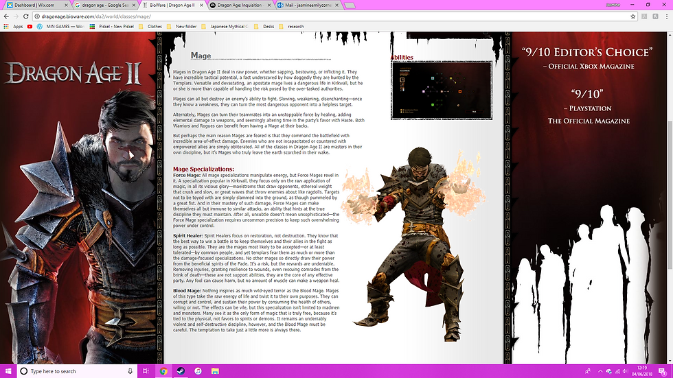
The class page for Mages is the same, along with the Warrior page which is below.
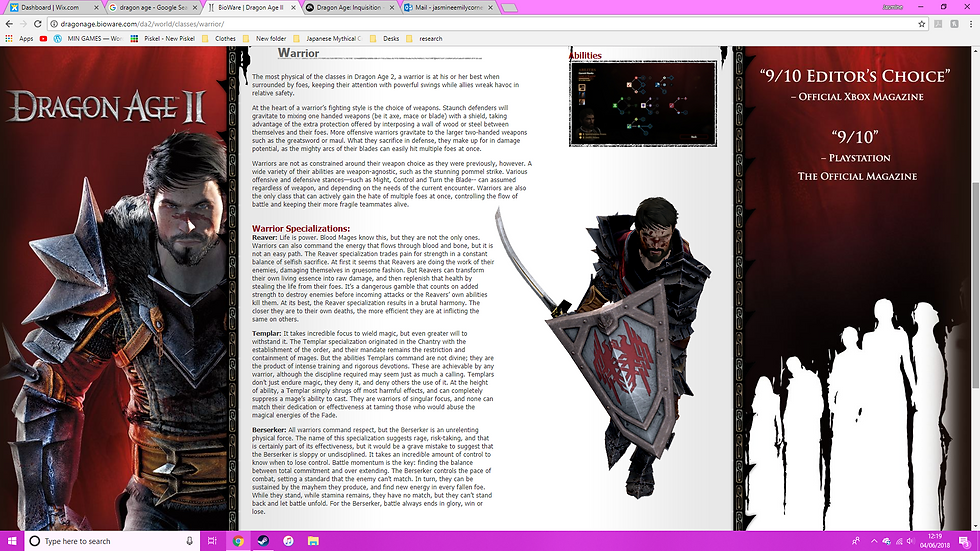
I like the layout of the different classes. It is simple yet effective, clear to read and easy to understand. A wider range of images could of possibly made this better so you can see what each of the classes look like more. It's clear what each class is by the visual indicators, the weapons. Though if you take the weapons away, could you still tell what class each character is?
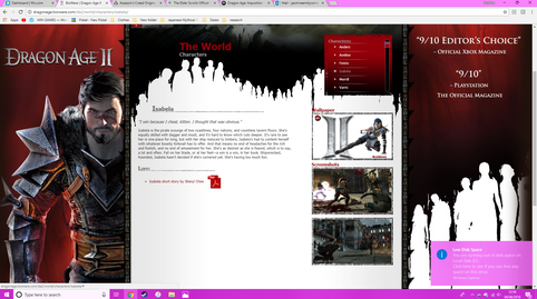
There are also pages for each of the creatures, which are very much layed out in the same way as the classes characters. It's the same with the characters pages which I will show below, but there are a few slight details that have changed.


Assassin's Creed: Origins Website:

Comments